2012-09-25 10:12:49
iOS6 Maps: The Media Is Wrong
Since the introduction of iOS6 last week, many articles have been written (most by people who have never used iOS6) about what a complete #FAIL iOS6 Maps is. To catch everyone up to speed, Apple decided to move away from Google Maps as the default mapping application to go with their own in the new OS. The single complaint everyone has is that when using the Satellite View in 3D mode, certain [tall] landmarks appear humorously distorted. Just do a search and you'll find pictures of the Eiffel Tower or various bridges that appear to be in ruin. Why did this happen? It's a pretty simple answer: math. Apple is applying a mathematical transformation to 2D satellite imagery in order to form it to topographical data in an attempt to make the maps look more like what a human would see (high mountains and low valleys) rather than a flat image. When you do this, objects that sit higher than the ground, such as bridges or monuments, will become distorted. It happens. Get over it. I'm sure they're working on fixing these issues as we speak. Do you really use 3D satellite view? I don't. I never have. When I use maps I want the plain map view that can give me directions; plain and simple.Overview
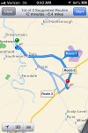 But on to the point of this article... To see what all the fuss was about, I decided to use iOS6 maps to guide me home from school. Living in a very small town in PA, if there was any place that a new mapping application would have incorrect roads and poor labels, it would be this area. So I started with the directions search and as you can see it looks almost identical to how it used to look. You are still given the option of three routes from which to choose. Once you begin, however, the magic happens.
Start Your Engine
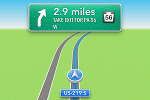 You'll immediately notice that upon starting your route the interface looks more like a traditional GPS device interface than a mobile maps interface. Your next move is large and in charge at the top of the screen and your current road is listed at the bottom. The phone also speaks your next move at multiple times: as soon as you make your previous move, when you are within a relatively close distance to your next move, and when you need to make your next move. This makes it extremely easy to focus on driving and not have to watch the screen; most GPS devices have this functionality. In addition, the maps have a 3D transform applied so that instead of getting a bird's eye view of a flat map you get a driver's eye view of the map. This makes it very easy to see roads and landmarks that are approaching and is more useful than a top-down view.
ETA
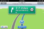 In the previous image you saw that the GPS interface went full screen, not even the standard info bar was visible. If you would like a little more information about your trip, you can simply tap the screen. When you do that the chrome will reappear and display more useful information, such as your remaining mileage and your estimated time of arrival.
Rerouting
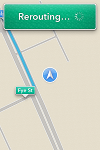 One problem that everyone has with GPS devices is the amount of time they take to reroute you if you miss your turn. By the time the device gets new directions you've most likely missed the new turn as well. That problem seems to have been solved with iOS6 Maps. On my trip, I wasn't going straight home. I was hungry after teaching class for three hours so I decided to go to Wendy's. Once I passed my exit, the app almost instantly gave me new directions that had me taking the next exit. I was still going to Wendy's, so I passed that exit as well and the app gave me new directions. There was less than a second delay for the app to reroute me. I was very impressed. It happened so fast that I couldn't even grab a screenshot. The screenshot you see is me in the Wendy's drive-thru, where the app had trouble finding my location since it isn't a real street.
Multiple Roads
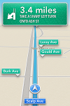 Part of this I've already mentioned, but I thought it was worthy of its own section. If you look at this image you'll see many roads listed. There are two items I want to mention. First, the road names are extremely clear. Instead of being unreadable text in between the pencil-thin lines of the road they are literal road signs with great contrasting colors. The second point is the distinction between roads you need to care about and roads that you don't need to care about. If you see a road sign in green it's just for reference. When something is in blue, that is either the road you're currently on or the road you will be turning onto soon.
Quick Turns
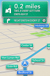 I was slightly worried when iOS6 Maps was revealed at WWDC. The GPS-style navigation was demoed and it took away one piece of functionality that I used, the ability to look ahead at future turns. I like to be prepared, having the next few turns in my head. This issue was allayed with the addition of quick turns. As you can see from the image, when you have a turn that occurs immediately after another, both turns will be displayed. This was very useful for me as the next turn was no more than 30 yards away.
The Home Screen
 Leaving the Maps app doesn't completely put it in the background like it did in the past. The same design is used as when you minimize a phone call, a colored bar is displayed at the top of your screen that can be tapped to immediately focus the app. A very important note, and something I couldn't capture a screenshot of, is that the iOS6 Maps app hooks into the Notification Bar. If the app is minimized and you have a turn approaching, you will get a notification at the top of your screen in the style of iMessage or Facebook notifications that alert you to the approaching turn. This was not possible with the Google Maps app and is a huge feature for people who may have their trip interrupted by some other activity on their phone.
You Have Arrived
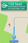 Most people who have used other GPS devices have probably been tricked when the device says, "You have arrived," only to have to frantically look around because you're not quite there yet. iOS6 Maps is by the far the most accurate GPS locator I have ever used. Each and every turn was precise and my arrival was spot-on. It was like a satellite was watching me in order to pinpoint my every move. When the phone spoke, "You have arrived," I looked left and my house was right there. This is a great feature for people taking trips to locations for the first time.
Conclusion
Does iOS6 Maps have its problems? Absolutely. Are the problems deal-breakers? No way. If you dare to remember when Google Maps was first released it was pretty bad. Apple is suffering from the same issues with their own brand-new service. In time, they will get better satellite imagery, fix the mathematics that poorly transform 2D maps to 3D terrain, and delay direction processing until after the GPS has a fix. I used it in a real-life situation and it performed perfectly... better than devices that only do GPS. I give it two thumbs up and a cup of Kool-Aid!Back
5 comments
2012-09-25 12:46:31
slonkak says...
Wow, spherical chickens in a vacuum, man. Seriously...
2012-09-25 15:48:43
Ryan L says...
Google Navigation has had this for like 3 years.
2012-09-25 15:53:34
Ryan L says...
Also, distorted pictures were hardly the only problem people complained about. In some cases, the navigation was telling people to make left and right turns when crossing bridges. The other big problem is that major landmarks were misplaced by up to a mile, streets having the wrong names, etc. etc.
2012-09-25 15:55:41
Ryan L says...
One more thing. Google Maps was released in 2005. Seven years ago. Yeah it was not great then... but it was pretty awesome from the get go my Windows Mobile phone in 2007, my BlackBerry in 2009-10 and simply amazing on my Android phone.
2012-09-25 12:18:10
Troy says...
http://www.huffingtonpost.com/2012/09/24/iphone-5-problems-users-b_n_1911038.html?utm_hp_ref=technology#slide=1561119